
Styling the layers at 1:10M
The Natural Earth dataset provides a set of layers at 1:10M. Most of them continue on the same track of the layers at 1:50M, offering more details: for these layers, the style will have to seamlessly continue to same symbology provided at lower scales, with attention to the new details. At the same time, new layers make their appearance, like roads and boundaries.
Extending the political map group
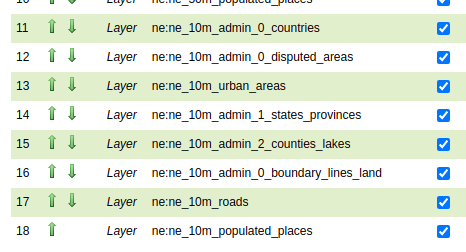
Let’s add the necessary layers to the ne_political layer group.
Add layers in this order, making sure the “use default style” checkbox is selected:
ne_10m_admin_0_countries
ne_10m_admin_0_disputed_areas
ne_10m_urban_areas
ne_10m_admin_1_states_provinces
ne_10m_admin_2_counties_lakes
ne_10m_admin_0_boundary_lines_land
ne_10m_roads
ne_10m_populated_places
The layer group should appear as follows:
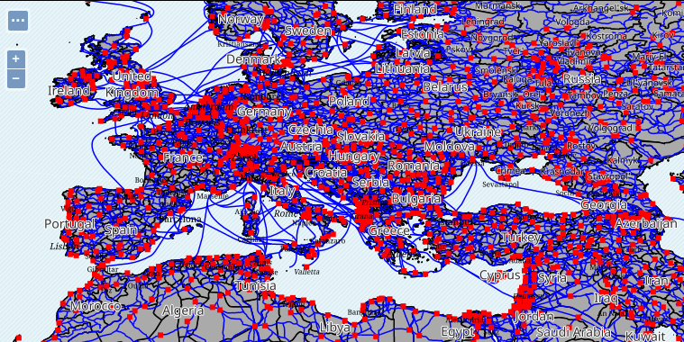
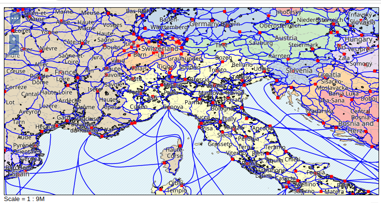
The map will show the 10M layers on top of everything, because, for the moment, they lack style scale dependencies:
Styling states and provinces
This is the first layer being styled, as it’s covering everything else: styling it first allows to see the work done in other layers, later on.
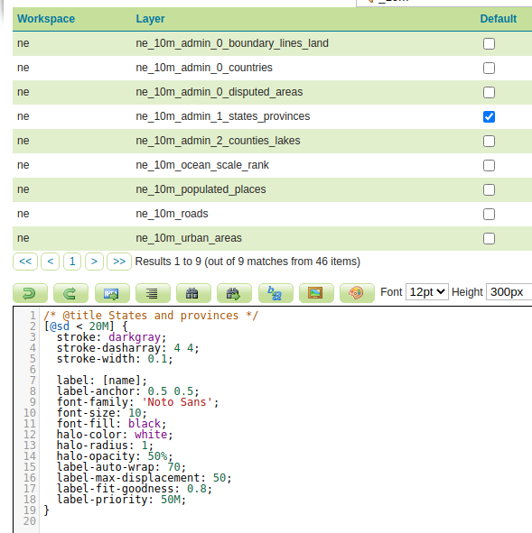
Let’s start by copying the styling available at 50M:
Create a new style
Name it
ne_10m_admin_1_states_provincesSet the workspace to
neSet the format to
CSSUse the
Copy from existing stylefunctionality, and choose the “ne_50m_admin_1_states_provinces_lakes” style. Click on CopyClick Apply
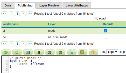
Switch to the Publishing tab, and associate the style to the corresponding layer.
Change the scale dependency so that the layer will show when the scale denominator is lower than 20M.
This file contains polygons as small as the provinces in Italy, and as big as the states in the USA. Some ranking in the labels is required to balance the output.
Looking at the data, the scalerank attribute can be used to tell apart the two cases:
Use a bigger font and a high priority when the scale rank is 2 or lower
Use a small fond and no priority when the scale rank is 3 or higher.
In addition to that, the 10M contains another level of administrative subdivision in places
like USA, so it’s best to make the stroke thicker for states/provinces, as the user zooms into the map.
The style uses the interpolate function on the scale denominator to control this.
The same goes for the size of the state labels, as they will end up interfering with the counties
ones, and need to be visually separate.
The resulting style should look as follows:
/* @title States and provinces */
[@sd < 20M] {
    stroke: darkgray;
    stroke-dasharray: 4 4;
    stroke-width: [interpolate(@sd, 2M, 2, 10M, 0.1)];

    label: [name];
    label-anchor: 0.5 0.5;
    font-family: 'Noto Sans';
    font-size: 10;
    font-fill: black;
    halo-color: white;
    halo-radius: 1;
    halo-opacity: 50%;
    label-auto-wrap: 70;
    label-max-displacement: 50;
    label-fit-goodness: 0.8;

    [scalerank <= 2] {
        font-size: [interpolate(@sd, 2M, 16, 20M, 10)];
        label-priority: 50M;
    };
}
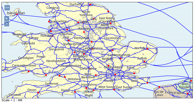
The layer groups should now look as follows:
Styling the countries
The countries layer is going to be very similar to the previous sets, so begin by copying over the 50M style and adjust the scale dependencies:
Create a new style
Name it
ne_10m_admin_0_countriesSet the workspace to
neSet the format to
CSSUse the
Copy from existing stylefunctionality, and choose the “ne_50m_countries” style. Click on CopyClick Apply
Switch to the Publishing tab, and associate the style to the corresponding layer.
Change the scale dependency so that the layer will show when the scale denominator is lower than 20M.
In addition to that, showing the country name when fairly zoomed in stop having much sense, as the context of the visualization only shows a small portion of its full geometry. As a result, the labels will be limited to 1:6M, and disabled below such scale.
The overall style looks as follows:
/* @title Countries */
[@sd < 20M] {
stroke: darkgray, 5%;
stroke-width: 0.1;

/* generated using https://colorbrewer2.org/#type=qualitative&scheme=Pastel1&n=7 */
fill: [Recode(MAPCOLOR7, 1, '#fbb4ae', 2, lighten('#b3cde3', '5%'), 3, '#ccebc5', 4, lighten('#decbe4', '5%'), 5, '#fed9a6', 6, '#ffffcc', 7, '#e5d8bd')];

    [@sd > 6M] {
        label: [NAME];
        label-anchor: 0.5 0.5;
        font-family: 'Noto Sans';
        font-size: 16;
        font-weight: bold;
        font-fill: lighten(black, 30%);
        halo-color: white;
        halo-radius: 1;
        halo-opacity: 70%;
        label-priority: [POP_EST];
        label-auto-wrap: 100;
        label-max-displacement: 50;
    }
}
The layer group show now look as follows:
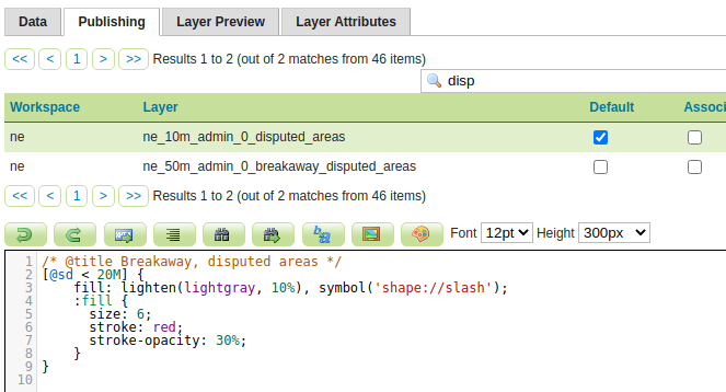
Styling the disputed areas
The disputed areas layer has the same meaning and contents as the 50M one, with better geometric accuracy and more, smaller polygons.
The styling will then be the same, with the sole difference being the scale dependency:
Create a new style
Name it
ne_10m_admin_0_disputed_areasSet the workspace to
neSet the format to
CSSUse the
Copy from existing stylefunctionality, and choose the “ne_50m_admin_0_breakaway_disputed_areas” style. Click on CopyClick Apply
Switch to the Publishing tab, and associate the style to the corresponding layer.
Change the scale dependency so that the layer will show when the scale denominator is lower than 20M.
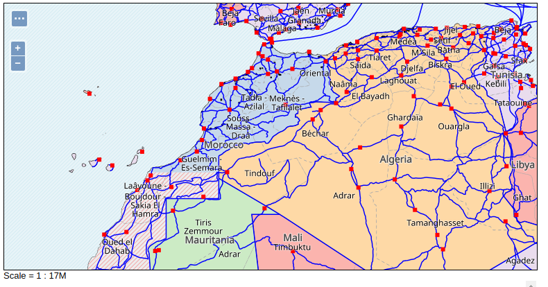
Focusing the group on the south of Morocco shows:
Styling the urban areas
The urban areas layer has the same meaning and contents as the 50M one, with better geometric accuracy and more, smaller polygons.
The styling will then be the same, with the sole difference being the scale dependency:
Create a new style
Name it
ne_10m_urban_areasSet the workspace to
neSet the format to
CSSUse the
Copy from existing stylefunctionality, and choose the “ne_50m_admin_0_breakaway_disputed_areas” style. Click on CopyClick Apply
Switch to the Publishing tab, and associate the style to the corresponding layer.
Change the scale dependency so that the layer will show when the scale denominator is lower than 20M.
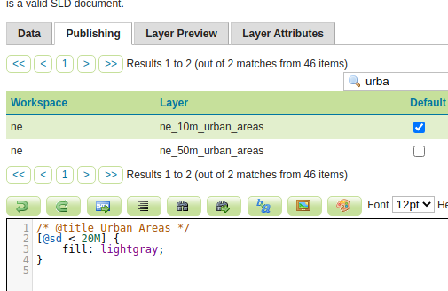
Given the size and complexity of urban areas at this zoom level, the color can be blended with the background color a bit, setting opacity at 70%. At the same time, it’s hard to tell apart the urban areas on the darker background, a darkgray stroke helps making them stand out. The final style looks as follows:
Focusing the group on UK shows:
Styling counties
Some countries are subdivided in provinces, while others, like USA, are
divided first in states, and then in counties. To handle this situation,
a third layer of administrative subdivision, ne_10m_admin_2_counties_lakes.
Let’s first create a basic style for it:
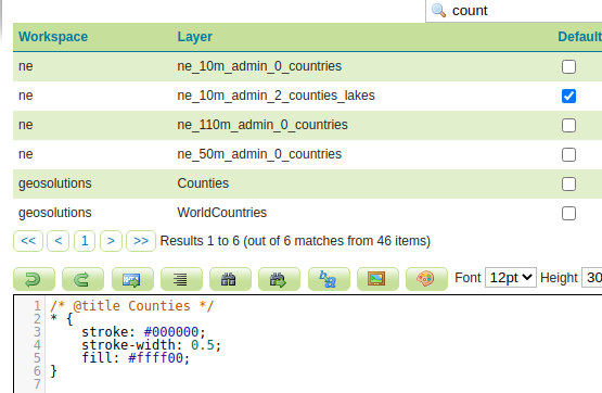
Create a new style.
Name it
ne_10m_admin_2_counties_lakes.Set the workspace to
ne.Set the format to
CSS.Use the
Generatefunctionality to create a basicpolygonstyle.Click Apply.
Switch to the Publishing tab, and associate the style to the corresponding layer.
Update the title to state “Counties”.
The style is going to be similar to the states one, but:
Counties are small, so it will show up when the scale denominator is below 8M.
The stroke is going to be dashed hairline (0.1 pixels wide).
The labels are going to show up at 1:2M.
The overall style will look as follows:
/* @title Counties */
[@sd < 8M] {
    stroke: darkgray;
    stroke-dasharray: 2 2;
    stroke-width: 0.1;

    [@sd < 4M] {
        label: [NAME];
        label-anchor: 0.5 0.5;
        font-family: 'Noto Sans';
        font-size: 10;
        font-fill: black;
        halo-color: white;
        halo-radius: 0.5;
        label-auto-wrap: 70;
        label-max-displacement: 50;
    };
}
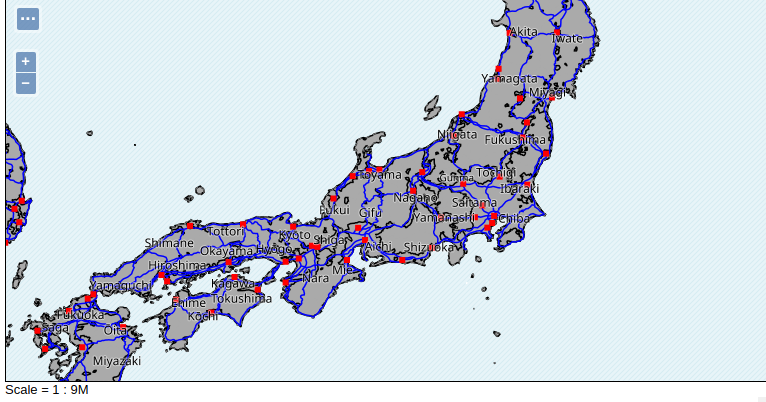
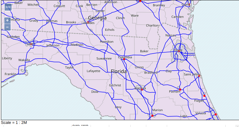
Focusing the layer group on the border between Florida and Georgia, the map should look as follows:
Styling the boundaries layer
The ne_10m_admin_0_boundary_lines_land contains land borders between countries.
A classic political map shows such borders using a thick red line, in this
implementation we are also going to consider the multi-scale nature of a web map.
Let’s first create a basic style for it:
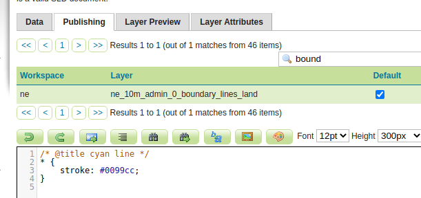
Create a new style.
Name it
ne_10m_admin_0_boundary_lines_land.Set the workspace to
ne.Set the format to
CSS.Use the
Generatefunctionality to create a basicpolygonstyle.Click Apply.
Switch to the Publishing tab, and associate the style to the corresponding layer.
Update the title to state “Country boundary”.
Now let’s improve the style:
Make the layer appear at scale denominators lower than 20M.
Set the stroke to red, 30% opacity.
Make the stroke width grow proportionally as the user zooms in, 5px at 1:4M, and down to 2px as 1:10M
The overall style should be:
/* @title Country boundary */
[@sd < 20M] {
    stroke: red;
    stroke-opacity: 30%;
    stroke-width: [Interpolate(@sd, 4M, 5, 10M, 2)];
}
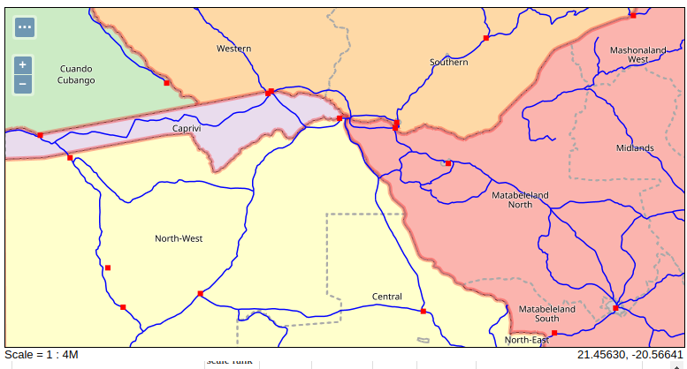
The layer group, in the area between Zimbabwe, Botswana and Zambia, should look as follows:
Styling the roads layer
The road layer is a new entry at the 1:10M level. As it’s probably evident by now, the density of the layer suggest to categorize the roads, and only display the most important ones first, revealing the others when the user is zooming in.
Let’s first create a basic style for it:
Create a new style.
Name it
ne_10m_roads.Set the workspace to
ne.Set the format to
CSS.Use the
Generatefunctionality to create a basiclinestyle.Click Apply.
Switch to the Publishing tab, and associate the style to the corresponding layer.
Update the title to state “Roads”.
Configure a scale dependency so that the layer does not show up before 1:20M
As a first step, separate the “roads” on water from those on land. The featurecla
attribute has two values, Ferry and Road:
The ferry routes should be blue (lightened 30%), 0.5px wide.
The land roads should be dark orange, 0.5px wide.
After this step, the style should be:
/* @title Roads */
[@sd < 20M] {
    [featurecla = 'Ferry'] {
        stroke: lighten(blue, 30%);
        stroke-dasharray: 4 4;
    };
    [featurecla = 'Road'] {
        stroke: darkorange;
        stroke-width: 0.5;
    };
}
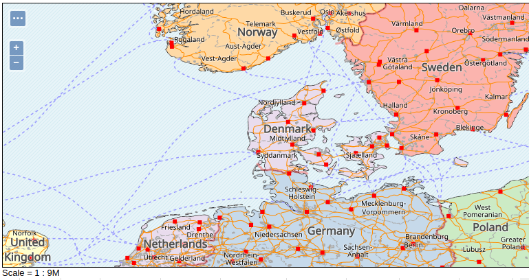
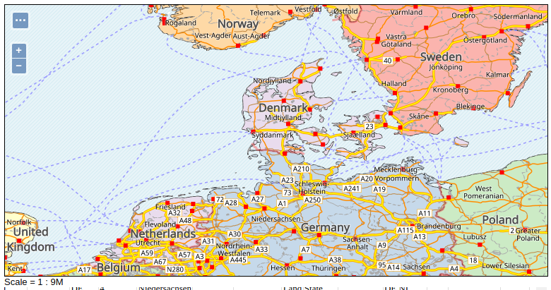
The layer group in the area around Denmark should now look as follows:
The land roads can now be divided in three separate categories, based on the type attribute:
Major Highway, which should use a double-stroke line, orange and yellow, 2px and 1px respectively, with proper overlap at intersections. These roads should appear first, at 1:20M.Secondary Highway, appearing later, at 1:10M, with a simple darkorange stroke, 1px wide.All other roads, which also appear at 1:10M, but should look less important. This can be achieved by using a thinner stroke (0.5px), and by using the
desaturatefunction to lower the intensity of the color a 50%.
After these changes, the style should be:
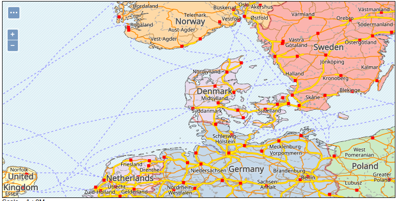
And the map should look as follows:
Finally, let’s consider labeling. Major highways are typically displayed using “road plates”,
that is, a background icon centered no the actual label. For this implementation, a simple
rectangular icon is used, enabled by the shield property, along with the shield-resize
property making the icon follow the size of the label.
The label property comes from the local attribute.
The final style should be:
   /* @title Roads */
   [@sd < 20M] {
       [featurecla = 'Ferry'] {
           stroke: lighten(blue, 30%);
           stroke-dasharray: 4 4;
       };
       [featurecla = 'Road'] {
           [@sd < 10M] {
               stroke: desaturate(darkorange, 50%);
               stroke-width: 0.5;
           };
           [@sd < 10M][type = 'Secondary Highway'] {
               stroke: darkorange;
               stroke-width: 1;
           };
           [@sd < 20M][type = 'Major Highway'] {
               stroke: orange, yellow;
               stroke-width: 3, 1;
               z-index: 0, 1;

               label: [local];
               label-anchor: 0.5 0.5;
               font-family: 'Noto Sans';
               font-fill: black;
               label-group: true;
               label-repeat: 200;
               label-max-angle-delta: 45;
               shield: symbol(square);
               shield-resize: stretch;
               shield-margin: 2;
               :shield {
                   fill: white;
                   stroke: orange;
                   stroke-width: 0.2;
               };
           };
       };
   }

And the map should look as follows:
Styling the populated places
The ne_10m_populated_places follows the same pattern
as its 50M companion, so let’s start by copying over the same style:
Create a new style
Name it
ne_10m_populated_placesSet the workspace to
neSet the format to
CSSUse the
Copy from existing stylefunctionality, and choose the “ne_50m_populated_places” style. Click on CopyClick Apply
Switch to the Publishing tab, and associate the style to the corresponding layer.
Change the scale dependency so that the layer will show when the scale denominator is lower than 20M.
Looking at the resulting map, one can make a few considerations:
Marks and font sizes are too small
The range of scale denominators covered by this layer is higher than the others (in terms of how many times a user can zoom in on it)
It’s then a good idea to make both the mark sizes and the font sizes proportional to the scale, by using an interpolate function.
Here is a suggestion of how the style can be updated:
/* @title Populated places */
[@sd < 20M] {
    mark: symbol(circle);
    :mark {
        fill: darkred;
    };
    [WORLDCITY = 1] {
        mark-label-obstacle: true;
        :mark {
        size: [Interpolate(@sd, 2M, 10, 10M, 7)];
        };
        label-offset: 0 -8;
        font-size: [Interpolate(@sd, 2M, 14, 10M, 10)];
    };
    [WORLDCITY = 0] {
        :mark {
        size: [Interpolate(@sd, 2M, 6, 10M, 3)];
        };
        label-offset: 0 -4;
        font-size: [Interpolate(@sd, 2M, 12, 10M, 8)];
    };
    [FEATURECLA like '%Admin-0 capital%'] {
        :mark {
        fill: orange;
        stroke: darkred;
        stroke-width: 0.5;
        };
        font-style: italic;
    };
    label: [NAME];
    label-anchor: 0.5 1;
    font-family: 'Noto Serif';
    font-fill: black;
    label-auto-wrap: 100;
    label-priority: [POP_MAX];
    label-padding: 2;
}
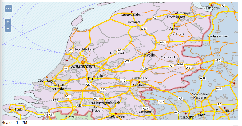
The layer group on the Netherlands now shows the following:
Further exercises
The first version of the map is now complete. We encourage the student to try more improvements, including:
The map is looking too crowded at 1:35M. What can be done to reduce the amount of information displayed, while keeping a good progression while zooming in?
Adding sea names, downloading and setting up the marine areas shapefile.