Styling the layers at 1:100M
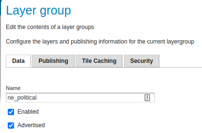
Setting up the political map group
Let’s start by creating a layer group named ne_political,
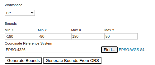
with a bounding box covering the entire planet in EPSG:4326.
The layer group should be contained in the ne workspace.
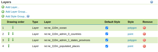
Then let’s add the following layers to the group, in this order:
ne:ne_110m_ocean
ne:ne_110m_admin_0_countries
ne:ne_110m_admin_1_states_provinces
ne:ne_110m_populated_places
Take care of setting the layers to use their default style, rather than directly referencing a specific style, that will make it easier to perform updates later.
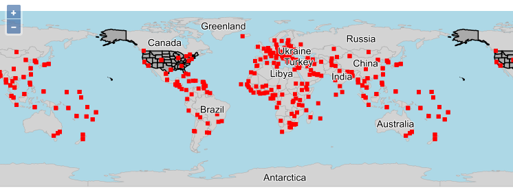
Save and perform a layer preview on the group, it should look as follows:
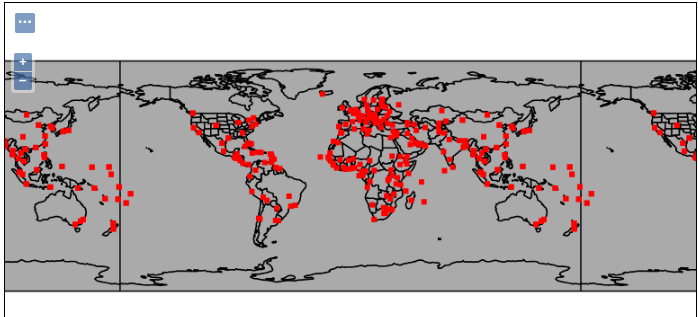
Let’s keep this preview open in a tab, in order to track the styling progress.
Styling oceans
Let’s create a basic CSS style for oceans:
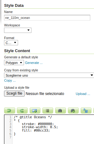
Create a new style
Name it
ne_110m_oceanSet the workspace to
neSet the format to
CSSUse the
Generatefunctionality to create a basicpolygonstyleFix the title comment to be
OceansClick Apply
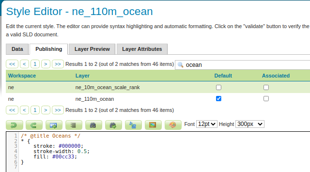
Switch to the Publishing tab, and associate the style to the corresponding layer:
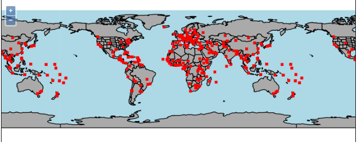
Now update the style:
Remove the stroke
Set the fill to
lightblueChecking the data at higher scales, we can see there are more oceans layers, so it makes sense to add a scale dependency. The next ocean layer is defined to work at 50M, while the current one is defined for 100M. Make sure the style turns off at 70M.
/* @title Oceans */
[@sd > 70M] {
   fill: lightblue;
}
Check the layer group preview, it should now look as follows:
Styling the countries
Following the same steps as in “Styling oceans”, let’s create a ne_110m_countries style:
Create a new style
Name it
ne_110m_countriesSet the workspace to
neSet the format to
CSSUse the
Generatefunctionality to create a basicpolygonstyleFix the title comment to be
CountriesClick Apply
Switch to the Publishing tab, and associate the style to the corresponding layer.
Now update the style:
Add a scale dependency to display this layer only below 1:70M (or in other words, when the scale denominator is above (70M)).
Set the stroke to
darkgray, 0.1 pixels wide.Set the fill to
lightgray.Add a label over the field
NAME, with fontNoto Sans, a small white halo
/* @title Countries */
[@sd > 70M] {
   stroke: darkgray;
   stroke-width: 0.1;
   fill: lightgray;

   label: [NAME];
   label-anchor: 0.5 0.5;
   font-family: 'Noto Sans';
   font-size: 14;
   font-fill: black;
   halo-color: white;
   halo-radius: 1;
}
Let’s check the styling progress in the layer group preview:
A classic political map has countries filled with different colors, so that
two neighboring countries do not share the same color.
The ne_110m_countries layer contains an attribute named MAPCOLOR7,
associating each country to a number from 1 to 7.
It’s possible to associate the number of a color, in a compact way, using the
Recode function.
In order to come up with suitable colors, it’s possible to use an online tool called Color brewer. Once on the web site:
Set the number of data classes to
9.Set
Nature of your datatoqualitative(meaning it’s not a color progression, each country is unique).Pick the
Pastelcolor scheme (the 4th from the left)The same setup can be obtained following this link.
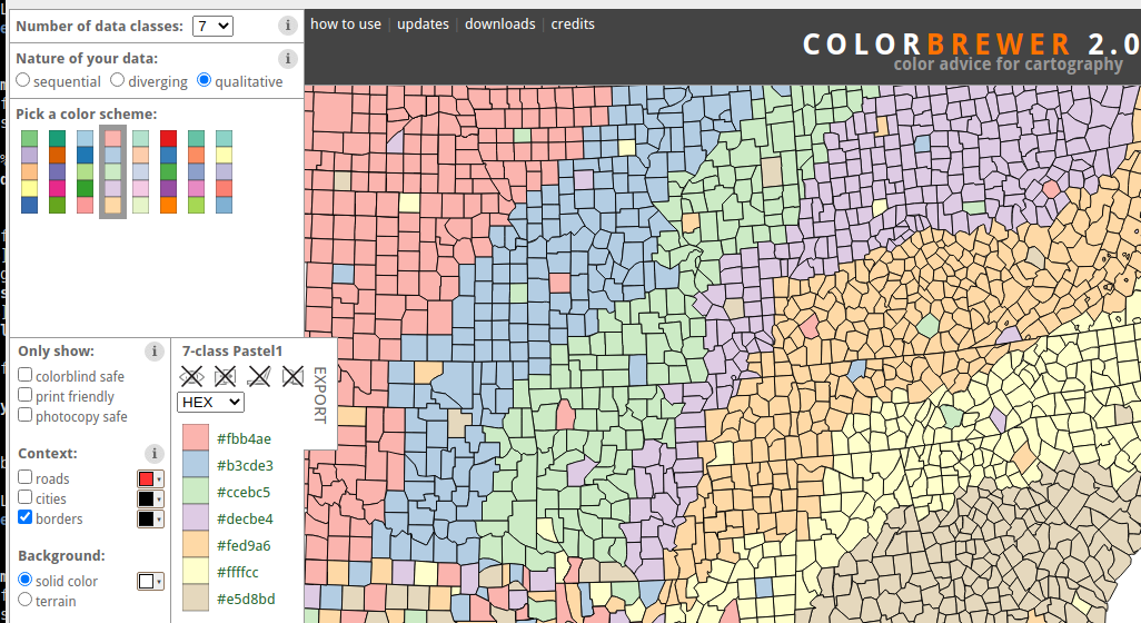
Then, copy the colors and build them into a Recode call, mapping number 1 to 7 to the colors.
The following snipped does exactly that, slightly adjusting a couple of colors using the lighten function,
which can be used to make a color lighter:
fill: [Recode(MAPCOLOR7, 1, '#fbb4ae', 2, lighten('#b3cde3', '5%'), 3, '#ccebc5', 4, lighten('#decbe4', '5%'), 5, '#fed9a6', 6, '#ffffcc', 7, '#e5d8bd')];
Let’s finally perform some final touches:
The stroke is now a bit too light,
darkencan be used to make it 5% darker.The text color is probably a bit too dark, use
lightento make it 20% lighter.Set up label auto-wrapping to 100 pixels.
Set up max displacement to 50 pixels, allowing country labels to move a bit.
The final style looks as follows:
/* @title Countries */
[@sd > 70M] {
   stroke: darken(darkgray, 5%);
   stroke-width: 0.1;

   /* generated using https://colorbrewer2.org/#type=qualitative&scheme=Pastel1&n=7 */
   fill: [Recode(MAPCOLOR7, 1, '#fbb4ae', 2, lighten('#b3cde3', '5%'), 3, '#ccebc5', 4, lighten('#decbe4', '5%'), 5, '#fed9a6', 6, '#ffffcc', 7, '#e5d8bd')];

   label: [NAME];
   label-anchor: 0.5 0.5;
   font-family: 'Noto Sans';
   font-size: 14;
   font-fill: lighten(black, 20%);
   halo-color: white;
   halo-radius: 1;
   label-priority: [POP_EST];
   label-auto-wrap: 100;
   label-max-displacement: 50;
}
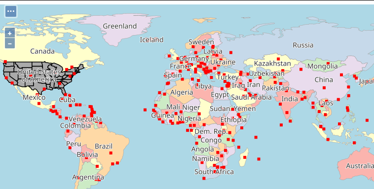
The map in the layer preview is now looking as follows:
Improving the ocean style
The color of the ocean is now a bit too similar to the country ones, making the map look flat and some of the countries shape hard to discern.
The ocean can be visually separated by:
Making it lighter, using lighten.
Superimposing a hatch fill using diagonal lines, just slightly darker than the base color.
/* @title ocean */
[@sd > 70M] {
   fill: lighten(lightblue, 15%), symbol('shape://slash');
   :fill {
      size: 5;
      stroke: lighten(lightblue, 10%);
      stroke-width: 1;
   }
}
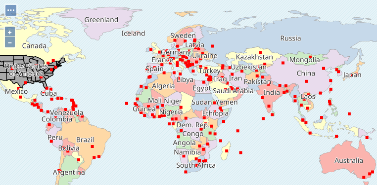
The updated map looks as follows:
Styling the states
The ne_110m_states layer contains only the US states. At the current zoom level,
the states are too small to be labelled, but showing their borders will add a useful visual reference to the map.
With this in mind, let’s create the style:
Create a new style
Name it
ne_110m_statesSet the workspace to
neSet the format to
CSSUse the
Generatefunctionality to create a basicpolygonstyleFix the title comment to be
StatesClick Apply
Switch to the Publishing tab, and associate the style to the corresponding layer.
Now let’s work the style:
Add scale dependencies so that the layer displays between 1:70M and 1:200M (states become too small to be seen after that).
Remove the fill, the style will only show the borders.
Set the stroke to
darkgray, 0.1 pixels wide, and make the stroke dashed using a4 4dasharray.
/* @title States */
[@sd > 70M] [@sd < 200M] {
   stroke: darkgray;
   stroke-dasharray: 4 4;
   stroke-width: 0.1;
}
The map now looks as follows:
Styling the populated places
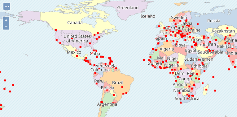
The ne_110m_populated_places contains a list of cities that are of world importance (not necessarily capitals).
At the current scale, using a big point marker would make the map crowded, and most labels would not fit. Also, this set of layers can be viewed at scales lower than 1:110M, where the map is overall even small, the style should take that into account.
With this in mind, let’s create the style:
Create a new style
Name it
ne_110m_populated_placesSet the workspace to
neSet the format to
CSSUse the
Generatefunctionality to create a basicpointstyleFix the title comment to be
Populated placesClick Apply
Switch to the Publishing tab, and associate the style to the corresponding layer.
Now let’s work the style, starting with the points:
Use a circular mark, size 4, filled in orange, stroked in dark-red, make the stroke 0.5px wide.
Click Apply, check how the points fill the map when zooming out
/* @title Populated places */
* {
  mark: symbol(circle);
  :mark {
     size: 4;
     fill: orange;
     stroke: darkred;
     stroke-width: 0.5;
  };
}
In order to make the point size more sensible vs the current scale, the Interpolate function can be used to make the size dependent on the scale, in a compact way. Update the size to be:
size: [interpolate(@sd, 70M, 4, 280M, 2)];
Finally, let’s consider the labelling. Labels at this scale can be small, like a hint, a promise that by
zooming in the user can find out more. Also, we don’t want labels to show up when too far zoomed out.
It would also be important to label bigger cities sooner than smaller ones, so the style will include
priority labeling based on the POP_MAX property.
Using a slightly different font also helps in visually telling apart country names from city names.
With this in mind:
Make labels appear when the scale denominator is lower than 140M
Label on
NAME, usingNoto Serif, 8 points, italicFill labels in black
Anchor them so that they are horizontally centered, and below the point, pushing them down with an offset another 5 pixels.
Set the label priority to
[POP_MAX]Auto-wrap the labels to 100 pixels, to keep the label visually close to the originating point
The final style should look as follows:
/* @title Capitals */
[@sd > 70M] {
   mark: symbol(circle);
   :mark {
      size: [interpolate(@sd, 70M, 4, 280M, 2)];
      fill: orange;
      stroke: darkred;
      stroke-width: 0.5;
   };
   [@sd < 140M] {
      label: [NAME];
      label-anchor: 0.5 1;
      label-offset: 0 -5;
      font-family: 'Noto Serif';
      font-size: 8;
      font-style: italic;
      font-fill: black;
      label-auto-wrap: 100;
      label-priority: [POP_MAX];
   }
}
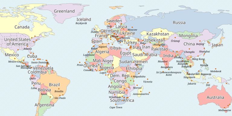
This is the overall political map, displayed at 1:140M, after these last changes: